Best Font for CV: Top Styles and Sizes for Maximum Impact
How much difference can a font make? Think about it: recruiters spend mere seconds scanning each CV. If your layout is cluttered or your font looks unprofessional, your content might never get the attention it deserves.
I've been helping people land their dream jobs for over 25 years, and trust me - the details matter when it comes to CV writing. In this guide, we'll cover the best fonts for your CV, the ones to avoid, and how to format your CV so it looks clean, confident, and recruiter-ready.
I’ll also share a few of the insider tricks I’ve picked up from reviewing thousands of CVs over the years. Let’s make sure your CV doesn’t just talk the talk, but looks the part too!
Table of Contents
-
Understanding the Basics of CV Fonts
-
What Makes a Font Suitable for a CV
-
The Role of ATS in Font Selection
-
Top Font Styles for CVs: Expert Recommendations
-
Fonts to Avoid: Why Comic Sans Won’t Work
-
Optimal CV Font Size for Maximum Impact
-
Practical Tips for Formatting & Choosing the Best Font for Your CV
-
Common Pitfalls to Avoid with CV Fonts
-
Perfecting Your CV Font for Job Success
-
Frequently Asked Questions (FAQs)
Understanding the Basics of CV Fonts
The right font won’t get you hired on its own, but the wrong one might shout “I made this in ICT class.” Here’s how to keep your CV career-ready!
What Makes a Font Suitable for a CV
A good CV font is clear, professional, and easy to read in both upper and lowercase. Think clean, simple lines - nothing too decorative.
There are a few different font types to get your head around:
- Serif fonts (like Times New Roman or Garamond) have those little flicks or “feet” at the ends of letters. They’re more traditional and often used in formal documents.
- Sans serif fonts (like Calibri, Arial or Helvetica) skip the fancy bits. They’re modern, clean, and great for screen reading.
Both serif and sans serif fonts are solid choices. They’re professional, accessible, and do a great job of keeping the reader focused on what matters: your experience.
What should you steer clear of?
- Cursive fonts, which mimic handwriting with flowing, curly strokes. These are best kept for wedding invitations!
- Display fonts are bold and decorative, making them great for posters or design portfolios - but too loud for a professional document.
- Monospaced fonts, most of which will make it look like you wrote your CV on typewriter. Some have more modern designs, but you'll generally want to avoid this one for your CV unless you're applying to be a time traveller.
The Role of ATS in Font Selection
Many companies now use Applicant Tracking Systems (ATS) to scan CVs before a human even looks at them. These systems don't exactly love fancy fonts! Stick with standard fonts that ATS software can read easily, or that beautifully written CV might never even get seen.
If you’re unsure whether your CV is ATS-friendly, you don’t have to guess. We offer a free CV review where we’ll check your document for ATS compatibility, and so much more.
We'll assess your CV against over 120 criteria, using years of experience to uncover strengths you didn’t know you had - and fix the weak spots you might’ve missed. Let’s make sure your CV gets past the robots and impresses the humans!
Top Font Styles for CVs: Expert Recommendations
So, which fonts should you use specifically? Here are a few tried-and-tested favourites that work brilliantly in 2025.
Traditional Fonts
Think of these as the CV world’s equivalent of a firm handshake. They signal respect for the role and help you come across as serious, capable, and ready to impress.
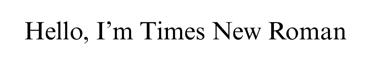
Times New Roman
A long-standing favourite, especially in more traditional or corporate sectors. It’s formal, familiar, and gets straight to the point.
Garamond
Slightly more elegant than Times New Roman, Garamond has a refined feel without being too fussy. It’s a great choice if you want something classic that still feels a bit more personal. Its spacing and smooth curves also make it very readable on both screen and paper.

Modern Options
If you want to keep things fresh, sharp and easy to read, a modern sans serif typeface is your go-to.
Calibri
Now the default font in Microsoft Word, Calibri has become a modern CV staple. It’s clean, compact and highly legible, making it a safe and sensible option for most industries. It balances professionalism with approachability, which is great when you want to sound confident without coming across as overly formal.

Arial
A widely used sans serif font that’s easy to read and looks sharp on digital screens. Arial doesn’t try to be flashy, which works in your favour. It’s straightforward, uncluttered and gets your message across with clarity, especially useful in fast-paced industries.
Helvetica
A favourite in design and marketing circles, Helvetica brings a smart, modern edge to your CV. It’s simple, stylish and well-balanced, offering excellent readability whilst being a little (yes, it is only a little!) different.

Creative Yet Professional
Looking to show a bit of personality while staying firmly professional? These fonts strike the balance.
Lato
A friendly, human-feeling font that still ticks all the boxes for professionalism. Lato works well for roles in people-focused sectors like HR, education or marketing. It adds personality without compromising clarity and makes your CV feel approachable and modern.

Open Sans
Clean, well-spaced and easy on the eyes, Open Sans is popular for online content and translates well to CVs. It’s especially good if you’re applying for roles in digital, tech, or creative sectors where a more contemporary feel is welcome but you still want to come across as grounded and reliable.

Fonts to Avoid: Why Comic Sans Won’t Work
Comic Sans does pop up from time to time, especially in education or childcare settings where a softer tone is often used. But when it comes to CVs, that same tone can work against you.
Even in teaching roles, Comic Sans can come across as unprofessional or outdated. The goal is to show personality and professionalism, and there are better fonts that do both.
Optimal CV Font Size for Maximum Impact
Once you’ve nailed the right font style, size is the next thing to get right. It might seem like a tiny detail, but it plays a big role in how your CV looks and feels.
Standard Sizes: 10–12pt for Body Text
For the main body of your CV - the job descriptions, bullet points, achievements - stick with something between 10 and 12 points. It’s that sweet spot where everything stays readable without taking up unnecessary space. Anything smaller and you risk making the reader squint. Anything larger, and it can feel like too much.
Heading Sizes: 14–16pt for Hierarchy
Your headings should stand out without shouting. Font sizes between 14 and 16 points work well for section titles like Work Experience, Education, or Skills. They help create a clear structure so the reader can quickly find what they’re looking for, especially when they’re reviewing dozens of CVs in one go.
Adjusting for Length and White Space
If your CV runs a bit long, it’s tempting to shrink the font to squeeze it all in - but don’t. A cramped CV is harder to read and risks putting recruiters off. If space is tight, trim the fluff, not the font. Prioritise clarity and use white space to your advantage. A well-spaced CV feels more professional and is easier to scan.
Accessibility Considerations for All Readers
A great CV should be easy for everyone to read. Many recruiters and hiring managers will be reviewing CVs on the go, on smaller devices, or may have visual impairments.
Stick to clean fonts with good spacing and avoid anything that feels cramped. Black text on a white background offers the best contrast and readability. Not only does this improve your chances of making a strong impression, but it also ensures your CV is accessible to as wide a range of readers as possible, which is always worth aiming for.
Practical Tips for Formatting & Choosing the Best Font for Your CV
83% of recruiters say they’re more likely to hire someone with a well-formatted CV. Ready to get yours working harder? Here’s how to do it right.
1. Consistency Across Sections
Mixing fonts, sizes or styles can make your CV look messy and disjointed, even if the content is brilliant. Keep things consistent throughout. Use the same font for your body text, and the same size and formatting for similar headings. It helps guide the reader and creates a more polished, professional feel.
2. Pairing Fonts: Headings and Body Text
If you want to use a second font for headings, make sure it complements your main font. For example, pairing a clean serif font for headings with a sans serif for body text (or vice versa) can create a nice visual contrast. But don’t go wild. Two fonts, used carefully, is usually enough.
3. Spacing and Alignment for a Professional Look
Give your text room to breathe. Adequate spacing between lines and sections makes your CV far easier to scan. Stick to left or justified alignment - they're what recruiters expect, and they keep everything tidy - and avoid using centre alignment except for headings.
4. Testing Readability on Different Devices
It’s easy to forget this step, but it’s a big one. Recruiters might be reading your CV on a laptop, a phone, or even in printed form. So before sending it off, test how it looks across a few different screens. Make sure it holds up in different formats and isn’t too cramped or light to read on smaller displays.

Common Pitfalls to Avoid with CV Fonts
Even with the best intentions, it’s easy to get tripped up by font choices. The good news? A few small tweaks can make a big difference. Here are some of the most common mistakes I see, and how to avoid them.
Overusing Bold or Italics
If everything’s bold, nothing stands out, and your CV ends up looking like it’s trying a bit too hard. Use bold to guide the reader’s eye to key headings or achievements, and italics to gently emphasise something important. Less really is more.
Not Considering Employer Preferences
Fonts can subtly reflect the tone of an industry. What works for a creative agency might not land as well in finance or law. Take a moment to think about where you’re applying and research the fonts popular in that industry. It can even help to look at the company’s own branding, as long as you don't go overboard! Take inspiration, but don’t mimic their font exactly.
Choosing an Incompatible Font
Not every font is supported on every device or platform (e.g. Mac vs. Windows), and the last thing you want is for your carefully formatted CV to fall apart on someone else’s screen. Stick with safe, widely recognised fonts and save your final version as a PDF to lock in the layout.
Perfecting Your CV Font for Job Success
You’ve made it this far, and by now, you’ll have seen just how much the right font can do for your CV. It's that subtle, silent confidence boost your CV’s been waiting for. So, let's recap what you need to do to set your CV up for success in terms of fonts.
Final Checklist for Font Selection
Before you hit send, take a moment to double-check the essentials.
- Is your font easy to read on a computer screen and phone screen?
- Have you stuck to one or two fonts?
- Are your headings and body text sized clearly and consistently?
- Is there enough white space to give everything room to breathe?
- Have you dodged the usual suspects like overly decorative, cursive, or retro typewriter fonts?
- Did you save it as a PDF so your formatting stays exactly how you want it?
Tick those boxes, and you’re well on your way to a cleaner, more impactful CV.
Next Steps: Pairing Fonts with Content
Of course, a professional font is only half the story. What you say still matters most. Use clear, confident language that highlights achievements rather than just listing duties. Keep bullet points punchy, verbs strong, and avoid filler that doesn’t add value.
Need help getting the words just right? We've got a full guide on how to write a CV that gets noticed for all the right reasons: How to Write a CV
Resources to Enhance Your CV Design
If you’re ready to step into the next stage of your career, we’ll help you look the part on paper. Our in-house graphic designers and writers work together to make sure your CV isn’t just well-written - it’s designed to reflect your value, potential, and where you’re headed.
Whether you’re chasing a dream role or aiming to level up your career, we’ll help you present your skills and potential in the strongest light.
Get in touch with us today and let’s create a CV that gives you the confidence to go after the opportunities you deserve.
Frequently Asked Questions
To wrap things up nicely, here are some of the most common resume font questions.
What is the Best Font Size for a CV?
The best font size for a CV is 10–12pt for body text and 14–16pt for headings. It should be easy to read without looking cramped or oversized.
Can I Use Two Different Fonts On My CV?
Yes, you can use two different fonts on your CV, as long as they complement each other and you use them consistently. You might use one for headings and one for body text.
Are There Fonts Recruiters Dislike?
Yes, there are fonts that recruiters dislike - fonts like Comic Sans, Papyrus, and overly stylised script or display fonts can come across as unprofessional. A general rule is that a clean and classic font wins every time!
How Do I Ensure My Font Works With ATS?
To make sure your font works with ATS, use widely supported, standard fonts like Calibri, Arial, or Helvetica, and save your CV as a PDF. This helps prevent formatting issues and keeps your CV readable by ATS software.

